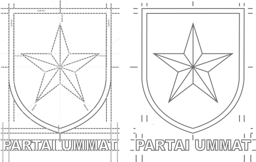
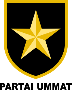
The construction of the establishment of the main logo of the Ummat Party, which is a unified visual identity of political organization and inseparable, is formed from a cemeteries pattern and reflects a strong character, and firm in working, fighting, moving in the fight against tyranny and upholding justice.
The main logo of the UMMAT PARTY forms a unity of the default configuration as seen on this page. All logo elements form a whole unit with a fixed and measurable position, as well as the color and shape of the letters.
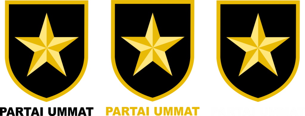
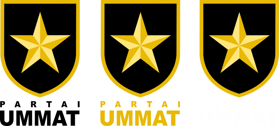
Visually, the MAIN LOGO of ummat party consists of the application of gram logo in the form of gold star shield surrounded by a firm line of arches two sides at the bottom that are fused with each other, and with the type logo in the form of the name “Ummat Party” in full. The main logo is divided into two compositions: vertical and horizontal.
Configuration & Composition
VERTICAL Composition
The application of gram logo is on top of the type logo with 2 models:
- The words “Ummat Party” become a single sentence in a row, with the order of the type logo read from left to right.
- The words “Ummat Party” are divided into 2 lines. The 1st line of “Party” and the 2nd line for the inscription “Ummat“, with the arrangement of the type logo reads from top to bottom.
HORIZONTAL Composition
The The application of gram logo is to the left of the logo type with the arrangement of the type logo read from top to bottom. Its use is done when aesthetically it looks better than the main logo of the vertical composition.
The use of this main logo arrangement takes precedence. It is not allowed to apply the party logo arrangement for the vertical and horizontal composition in flip vertical or flip horizontally and rotate right 90° or rotate left 90 °, or apply the distance of empty space between the gram logo and logo type, including between words arbitrarily outside the predetermined provisions.
Typography/Typeface
Main Typography: The typeface in the inscription “UMMAT PARTY” on the type logo, derived from the arial black letter group. For visual consistency, the writing of all identity devices and party communication is attempted using this typeface. Arial Black was chosen because it has a modern character, formal but not rigid and has a high level of readability. This typography is required in correspondence, promotional and publication materials. The selection of typefaces is based on consideration of readable characteristics, varied, well known and easy to obtain.
LAUNCHING LOGO | PHILOSOPHY | COLOUR IDENTITY | HISTORIOGRAPHY


